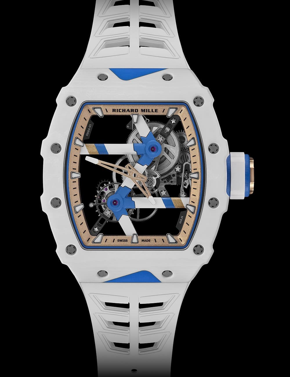
Look through the face of Richard Mille’s RM 64-01 and the bicycle connection becomes obvious. White structural lines meet blue junctions across an open movement, with gold accents cutting through the centre. The collaboration with Colnago has a visual idea you can actually follow: a racing frame, translated into the architecture of a watch.
The RM 64-01 Tourbillon Colnago is limited to 50 pieces. Its hand-wound movement displays hours and minutes and has a stated power reserve of approximately 65 hours. The case uses Azure Blue and White Quartz TPT, with a grade 5 titanium baseplate and bridges inside. Richard Mille lists the case at 43.21 by 49.94 mm and 14.23 mm thick.
The collaboration is in the structure
According to Richard Mille, the bridge geometry refers to Colnago’s Master frames, while the colour palette draws on the C68. Colnago describes the project as a translation of its technical and aesthetic identity. In the product photographs, that is an easier claim to understand than the usual broad language about two brands sharing a passion.
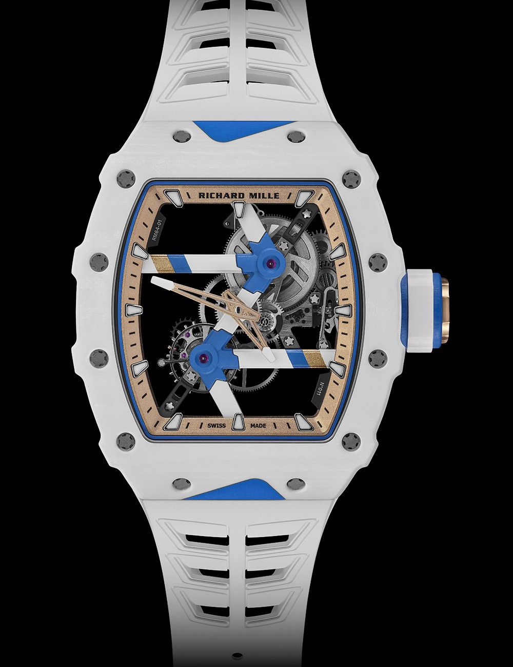
Image: Richard Mille.
The open spaces are what sell the idea. Your eye can trace the white supports from one blue junction to another, with the dark background making the construction easier to read. The impression is closer to a small mechanical assembly on display than to a conventional dial decorated with a bicycle motif.
That gives the watch a useful second life as a design object. You do not need to know a rider’s results or recognize a team jersey to understand why these two companies ended up in the same room. The connection remains visible when the marketing copy is taken away.
Lightness is an ambition, size is a measurement
The brand emphasizes lightness, but that should not be confused with smallness. Those case dimensions describe a substantial object. We have not worn or weighed it, so the images cannot support a claim that it disappears on the wrist. What they do show is a design determined to reveal as much empty space as machinery.
The white-and-blue palette helps. It makes an intricate watch look crisp, while the gold-toned accents interrupt what could otherwise feel clinical. Our favourite detail is how the supports create their own graphic pattern across the face. You can appreciate it as a composition before trying to identify every moving part.
A collaboration worth zooming in on
The RM 64-01 is an invitation to look closer. The limited production explains its exclusivity; the construction explains why it merits attention beyond that. For anyone interested in how an idea travels between design disciplines, this is the part to remember: the bicycle reference helps shape the watch itself.