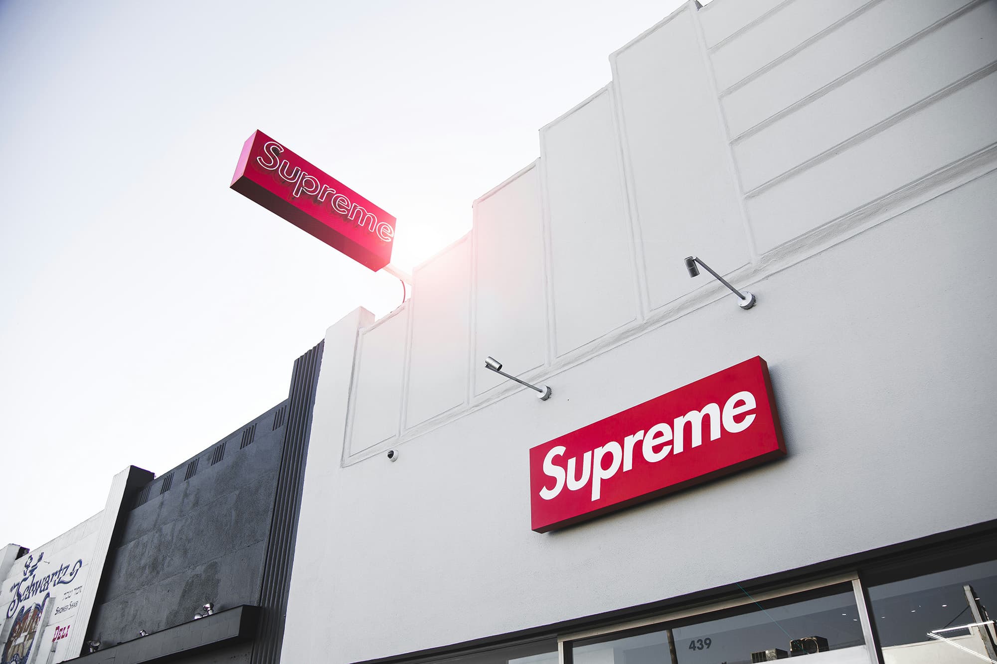
Supreme is owned by an eyewear conglomerate. Sit with that for a second. The brand that defined downtown skate-rat cool, that turned a red rectangle into the most copied logo of the century, that made grown adults camp on Lafayette Street for a branded brick is now a line item on the balance sheet of EssilorLuxottica, the Franco-Italian giant behind Ray-Ban and Oakley, which closed its $1.5 billion acquisition in October 2024. The question this raises isn't really about ownership. It's about meaning. In 2026, does the box logo still stand for anything?
The Corporate Reality
Let's be fair to the new owners. EssilorLuxottica has said the right things, pledging to preserve Supreme's "unique brand identity, fully-direct commercial approach and customer experience." And so far, the new ownership has changed almost nothing visible. The drops still drop. The lines still form. The collabs still come. For the eyewear giant, Supreme is a strategically brilliant acquisition: an owned brand with extraordinary credibility among exactly the young, style-driven consumers that legacy companies struggle to reach authentically. On paper, it's a clean deal.
But "changed nothing yet" is doing heavy lifting in that sentence. Supreme has now passed from James Jebbia's founder-led vision, through VF Corporation's ownership, and into the hands of a company whose core business is selling glasses at scale. The brand has been institutionalized. The question is what institutionalization does to a thing whose entire value was its outsider posture.
The Authenticity Paradox
Here's the uncomfortable truth at the center of Supreme's story: it stopped being a subculture a long time ago. The transgression that made Supreme cool (the bootleg riffs, the middle-finger collabs, the deliberate scarcity that mocked the people chasing it) curdled into a system the moment Supreme became a multibillion-dollar business. The brand has been a luxury operation for years. The EssilorLuxottica deal didn't kill Supreme's soul; it just made the autopsy official.
And yet the box logo still moves units, still anchors a resale market, still functions as cultural shorthand. That tension (institutional ownership versus enduring street credibility) is the most interesting thing about Supreme in 2026. It's a brand running on accumulated meaning, like a currency backed by a gold reserve that everyone suspects might be empty. As long as people believe the box logo means something, it does. The danger isn't a bad collab. The danger is the day people stop believing.
The Larger Split
Supreme's identity crisis is really streetwear's identity crisis, and right now the culture is pulling in two opposite directions at once.
On one side: logomania nostalgia. There's a powerful pull back toward the loud, branded, look-at-me dressing of streetwear's golden age: the box logos, the monograms, the graphics that announce exactly what you spent. Supreme is the patron saint of this mode. It's fun, it's legible, it's a flex, and there's a generation discovering it secondhand and finding it thrilling.
On the other side: quiet luxury and stealth wealth. The fastest-rising aesthetic of the mid-2020s is the photo negative of logomania: muted neutrals, no visible branding, clothing whose value is invisible to anyone who doesn't already know. The whole point is that you can't tell what it cost. This is the gorpcore-goes-quiet, Aimé-Leon-Dore-restraint, "if you know you know" sensibility that has colonized the high end of the market.
Supreme is structurally trapped between these poles. Its entire equity is in a logo: the loudest, most recognizable mark in the game. That's a tremendous asset in a logomania moment and a liability in a quiet-luxury one. And the market is currently doing both simultaneously, which means Supreme is perfectly positioned and badly exposed at the same time.
What Survival Looks Like
So can Supreme still have a soul under corporate ownership? Here's the honest answer: soul was never the right frame. Supreme's genius was never sincerity. It was attitude, scarcity and timing. What it needs to survive isn't authenticity in some pure sense; it's relevance. It needs to keep producing the cultural moments (the right collab, the right surprise, the right tension) that make the box logo feel alive rather than embalmed.
That's harder under an eyewear conglomerate than it was under a founder, not because EssilorLuxottica is evil but because institutions optimize for predictability, and Supreme's whole magic was unpredictability. A brand built on the threat that it might do something insane doesn't survive long once everyone knows it answers to a quarterly earnings call.
The Verdict
Supreme isn't dead, and it isn't going to die soon. The box logo has decades of accumulated meaning and a resale market that won't evaporate overnight. But it's running on reserves, caught between a logomania revival that flatters it and a quiet-luxury wave that renders it gauche. The eyewear giant can preserve the machinery: the drops, the stores, the supply chain. What it can't manufacture is the feeling that Supreme might, at any moment, do something nobody saw coming. And without that feeling, the red box is just a red box. Beautifully made, endlessly resold, and increasingly, just a logo.